✺ Desktop App Download page
Crafted a captivating download page to
boost ABCmouse Desktop Unity Client
adoption
The ABCmouse Desktop Unity Client (DUC) download page project aimed to create an engaging and user-friendly experience that effectively informed existing users about the benefits of the desktop app. The primary goal was to encourage users to download the DUC and access the most up-to-date learning activities, experiences, games, and events on their computers.
Client
Age of Learning Inc.
Duration
2 Weeks
Tools
Figma, Photoshop, Illustrator, Jira, Confluence
Methods
Visual Design, Responsive Design, Data Analytic, User Testing
Key results and Impacts
My Role
Team
Challenge
The initial design was cluttered, and the information about the benefits of the desktop app was unclear and not prominently displayed. The call to action lacked persuasive power, and the information hierarchy was scattered, creating a suboptimal user experience. As technology and technical advancements continued to improve the app for both mobile and desktop, it became crucial to persuade the users that still using the browser version to transition to the native app to get the most out of it.

Rationale
We aim to transition users from the desktop browser to DUC, as engagement on DUC is higher. With DUC, users spend more time (+35% per day), achieve a higher completion rate (+26% per day), and experience a lower cancellation rate (-26%).
Process and Solution
User research:
Together with the research team, we conducted research to understand the preferences and needs of existing users, as well as the problem with current Desktop app download page.
User Interview: We conducted an online interview and divided the questions into two groups
–> Question on the current usage
–> Questions on the design
Design audit: Based on the feedback we received, we have identified what needs to be fixed.
–> Information hierarchy: Redesigned the information hierarchy to prioritize the benefits of the desktop app and present them in a clear and engaging manner.
–> Call to action: Refined the call to action to be more persuasive and prominent, encouraging users to download the DUC.
–> Visual design: Streamlined the visual design to reduce clutter and improve the overall user experience.
–> Responsive design: Ensured the information page was responsive and accessible across various devices and screen sizes.
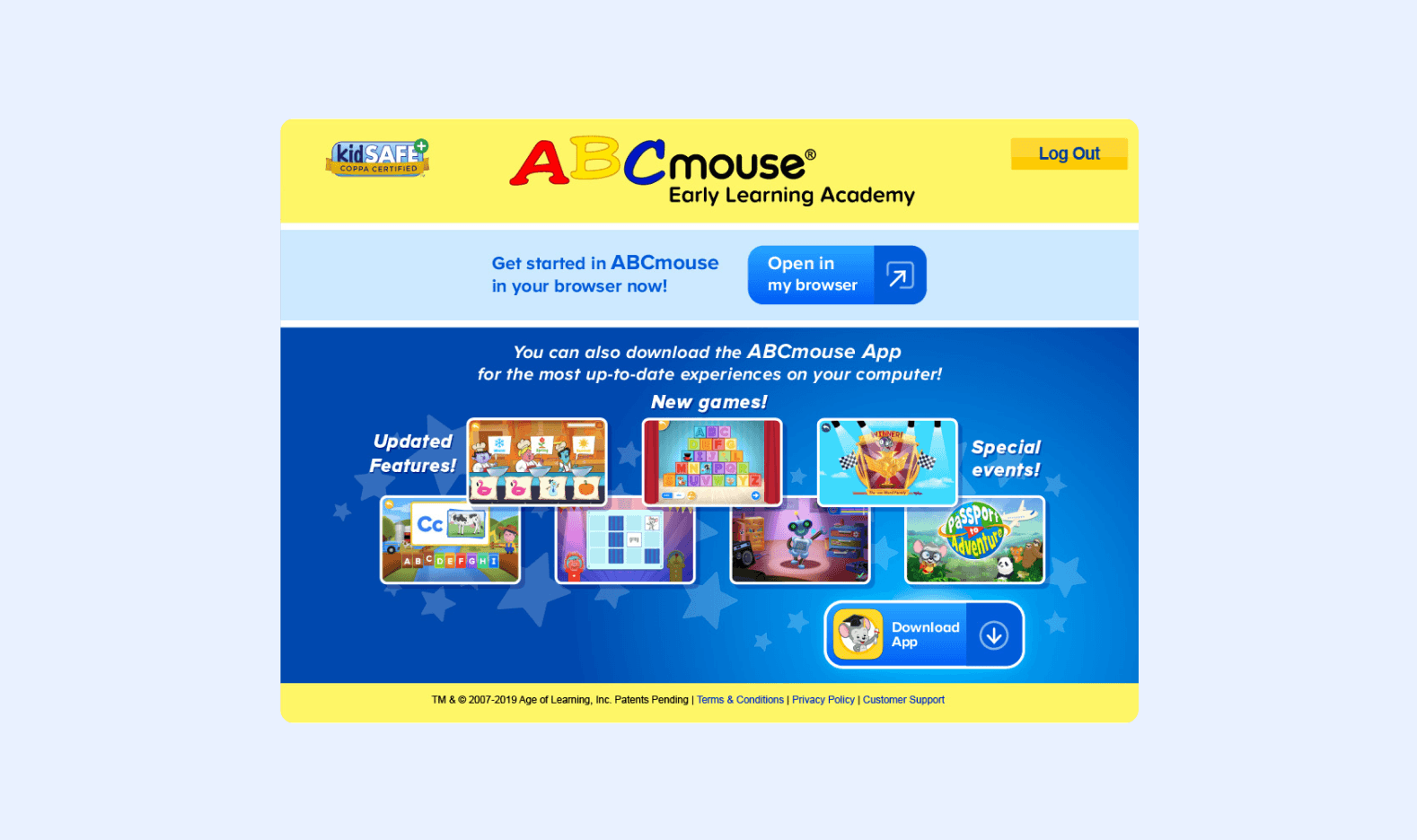
Current Design
Identify the current problems
–> The download button is not clear or prominent enough.
–> There are not enough instructions provided on how to download the app.
–> The download page had unclear focus and the communication copywriting was unclear.
Design
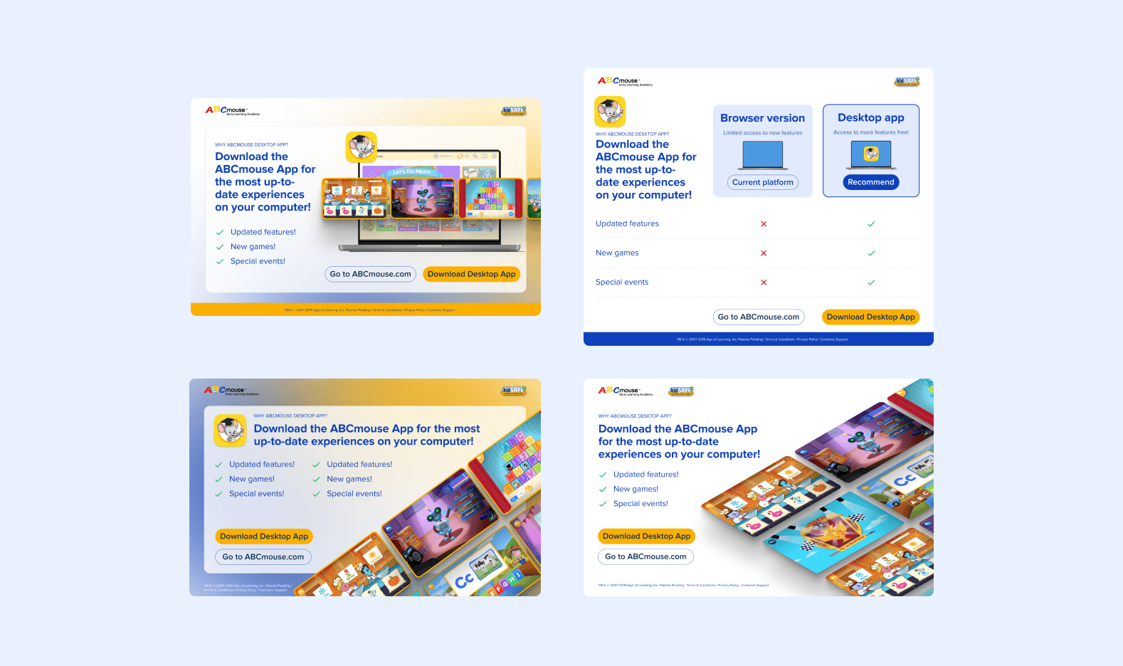
First Iteration – I designed in 4 layouts
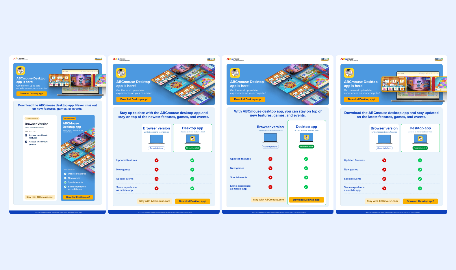
Second Iteration – I mixed the designs from the first iteration

Third Iteration

Test Iteration
Test
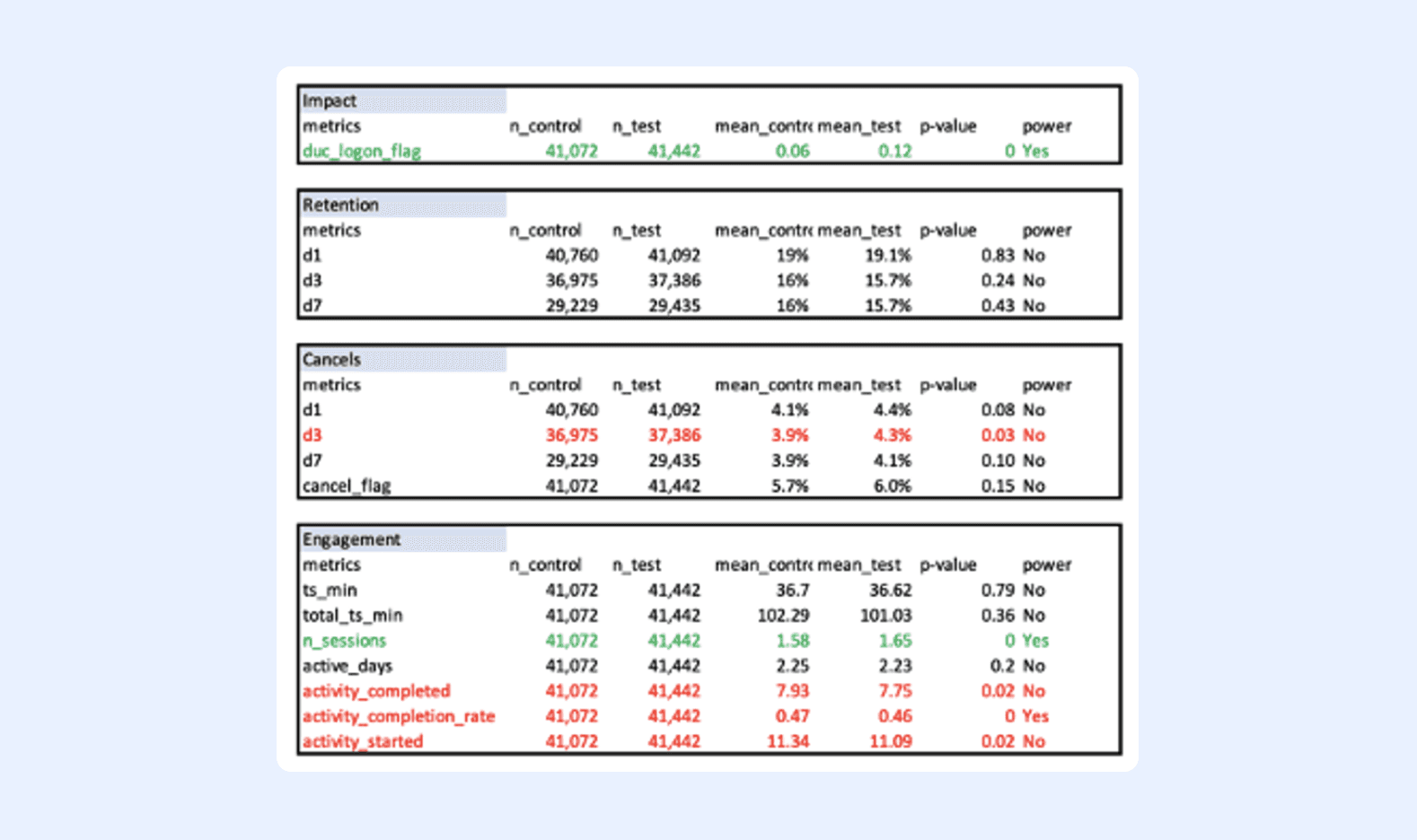

Learnings:
User interview results can sometimes bias the actual outcome. Therefore, it is crucial to run an A/B test before making a decision on new features.